How to Build a Gallery Wall with Island Prints: A Step-by-Step Layout Guide
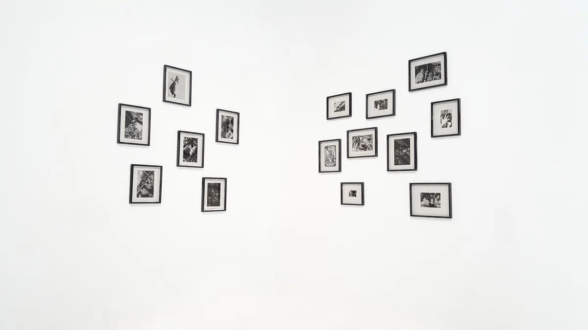
An island print can do a lot on its own: a tide chart, a harbor photograph, a botanical study from a windswept coast. Put five or seven together and the wall starts telling a story. The trouble is that a gallery wall is easy to imagine and harder to hang. Frames drift too high, gaps go uneven, and a promising pile of prints turns into a puzzle you are solving with a drill in your hand. The fix is to do the planning on the wall before the nails go in. Measure the space, choose a spacing rule, mix sizes with purpose, and test the layout at eye level. Then hang once, level, and leave it alone.
Start with the Prints, Not the Wall
Before you measure a single inch, lay the candidate prints on the floor or a large table. This is where you decide what the wall is about. A coastal gallery wall works best when the pieces share a thread: a muted blue-green palette, a subject like shorelines or island flora, a set of similar frames, or a mix of vintage maps and contemporary photography that feels collected rather than matched.
Pull more prints than you need. It is easier to edit down than to fill a hole later. Include one piece that can act as the anchor—typically the largest or darkest image—and let the others support it. A big vintage island map, a bold black-and-white harbor shot, or a wide horizon print can carry the group. Smaller pieces—seabird studies, shell prints, postcards, small sketches—add rhythm.
Build a family, not a matching set
Matching frames can look tidy, but identical everything can also look like a showroom. Try one frame finish across the group and vary the mats, or keep the mats consistent and let the frames shift between natural wood, black, and thin brass. If you are framing island prints in different sizes, a common mat width—say two inches—will make the group feel intentional even when the images are not.
Measure the Wall and Mark Your Zone
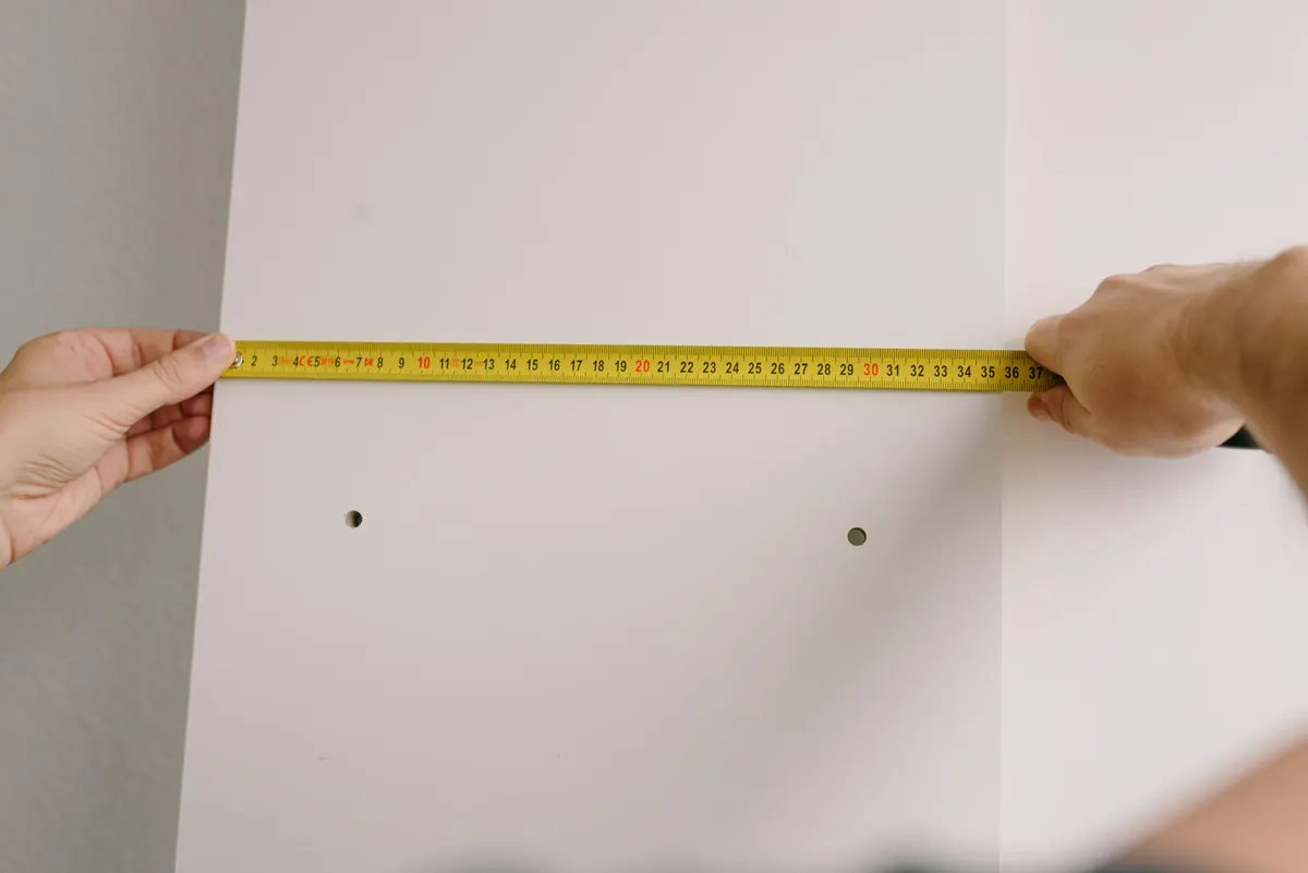
Now measure the wall. You need the width and height of the available area, but also the furniture below it. A gallery wall above a sofa has a different center point than one above a console or in a hallway. As a general guide, the center of the arrangement should sit around 57 to 60 inches from the floor, which is roughly eye level for many adults. Above a sofa, leave about 6 to 10 inches between the top of the sofa back and the bottom of the lowest frame. Too high and the art floats; too low and it crowds the furniture.
Use painter's tape to mark the outer boundary of the arrangement on the wall. This is not the final layout, just the zone. It stops the group from creeping toward the ceiling or spreading past the furniture. If the wall is wide and the prints are small, consider a tighter cluster rather than stretching the pieces across the whole space. A gallery wall should feel like one composition, not a border.
Set Your Spacing Rules
Consistent spacing is the quiet hero of a good gallery wall. Pick a gap and repeat it. For most frames, 2 to 3 inches between edges works well. Small prints can sit closer, around 1.5 to 2 inches, while large frames need a little more breathing room. The gap should be measured from frame edge to frame edge, not from the image or the mat.
Cut a spacer from cardboard or use a small block of wood to keep the distance steady as you test the layout. If you are mixing frame depths, measure from the front face of each frame so the visual gap stays even. Write your spacing number down. When you are on a ladder with a level in one hand, memory is not your friend.
Mix Print Sizes With a Clear Hierarchy
A gallery wall with all the same size prints can work as a grid, but island prints often come in a range of shapes: panoramic horizons, square botanical studies, portrait-oriented maps. Mixing them is part of the appeal. The trick is hierarchy. Give the group one anchor, two or three medium pieces, and several small ones. Three, five, or seven pieces often feel natural, but a tight grid of six can also be right. The number matters less than the balance.
Think about visual weight. A dark, high-contrast photograph is heavier than a pale watercolor of the same size. Place heavier pieces low or toward the center, and let lighter pieces sit at the edges. If one side of the arrangement feels crowded, swap a small print for a larger one on the opposite side rather than adding another piece.
- Grid: clean and calm; best with same-size frames or a strict row-and-column plan.
- Salon style: dense and collected; works with mixed sizes and a consistent gap.
- Column: good for narrow walls or beside a door; stack two or three prints vertically.
- Asymmetrical cluster: relaxed and coastal; build around one anchor and balance by eye.
Keep the bottom edge of the group roughly aligned when the wall sits above furniture. The top edge can wander. That single rule makes a mixed layout look deliberate without forcing every frame into a grid.
Test the Layout Before You Hang
This is the step most people skip. Do not skip it. Cut paper templates for each frame, write the print name on the back, and tape them to the wall. Or lay the actual frames on the floor and trace the arrangement, then transfer the outlines to the wall with painter's tape. Step back. Sit on the sofa. Walk in from the hallway. A layout that looks good from six inches away can fall apart from across the room.
- Lay the frames on the floor in the planned arrangement and photograph them from above.
- Cut paper templates to the exact size of each frame and mark the hanging point.
- Tape the templates to the wall using your spacing rule and the measured center height.
- Check the arrangement from the main viewing spot, then from the doorway.
- Leave the templates up for a day if you can. Adjust before any holes are drilled.
If a template feels wrong, move it. It is much easier to shift paper than to patch plaster. Pay attention to how the group sits against nearby windows, lamps, and door frames. The wall is not a blank canvas in isolation; it is part of a room.
Hang Level and Check Twice
Once the paper layout is right, mark the hanging points. Measure from the top of each frame to the hanging hardware—D-rings, wire, or a sawtooth hanger—and transfer that measurement to the template. Use a level to draw a faint horizontal line for the top edge of each frame, then mark the hook position. For wide or heavy frames, use two hooks rather than one wire; it keeps the frame from tilting.
Drill carefully, use the right anchor for your wall type, and hang the center piece first. Work outward. Check level after each frame. If a frame sits a little proud of the wall because of a deep profile, adjust the hook rather than forcing it. Small errors are easier to fix now than after the whole group is up.
The Final Walk-Through
Before you call it finished, stand in the spot where you will see the wall most often. Check the spacing, the level, and the balance. Is the anchor piece doing its job? Does the group feel connected to the furniture below? If something bothers you, live with it for a day. A gallery wall should look collected, not corrected. When the layout holds from the sofa, the doorway, and the kitchen, stop adjusting and enjoy the view.
Photo: Trash Art / Pexels